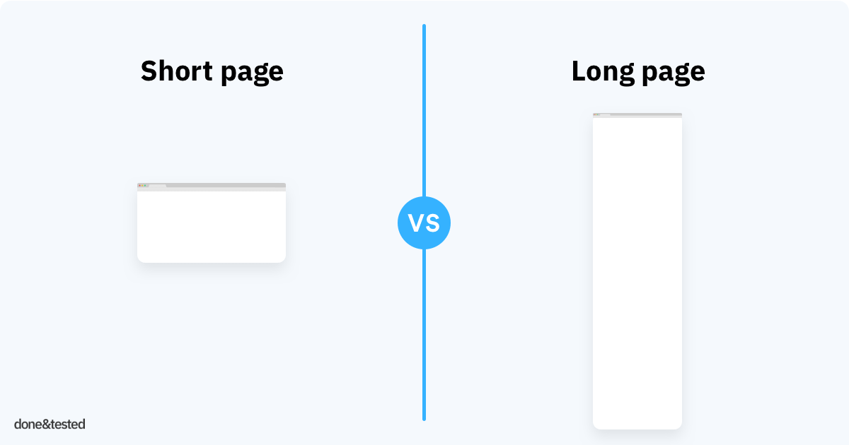
Page length can be a tricky thing to nail. Make it too short, and you won’t be able to fit on all the information you want to share. Make it too long, and users may grow bored and leave prematurely.
learn more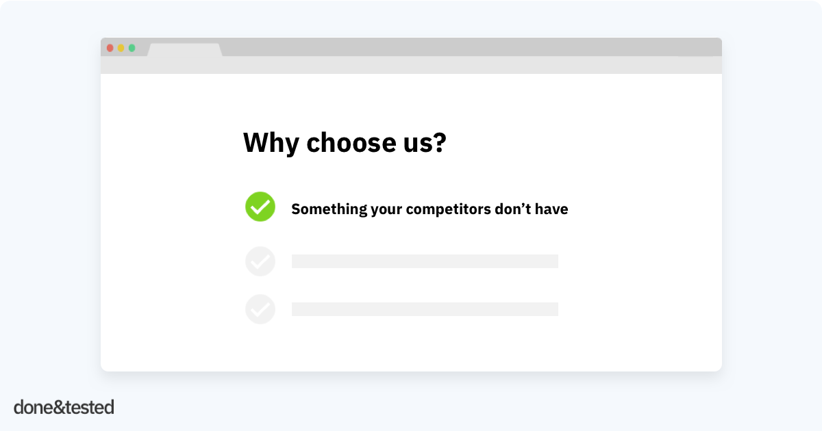
When you offer free shipping, and your competitors do as well, your USP is not unique. I see this very often: businesses don’t compare their USP’s with competitors.
learn more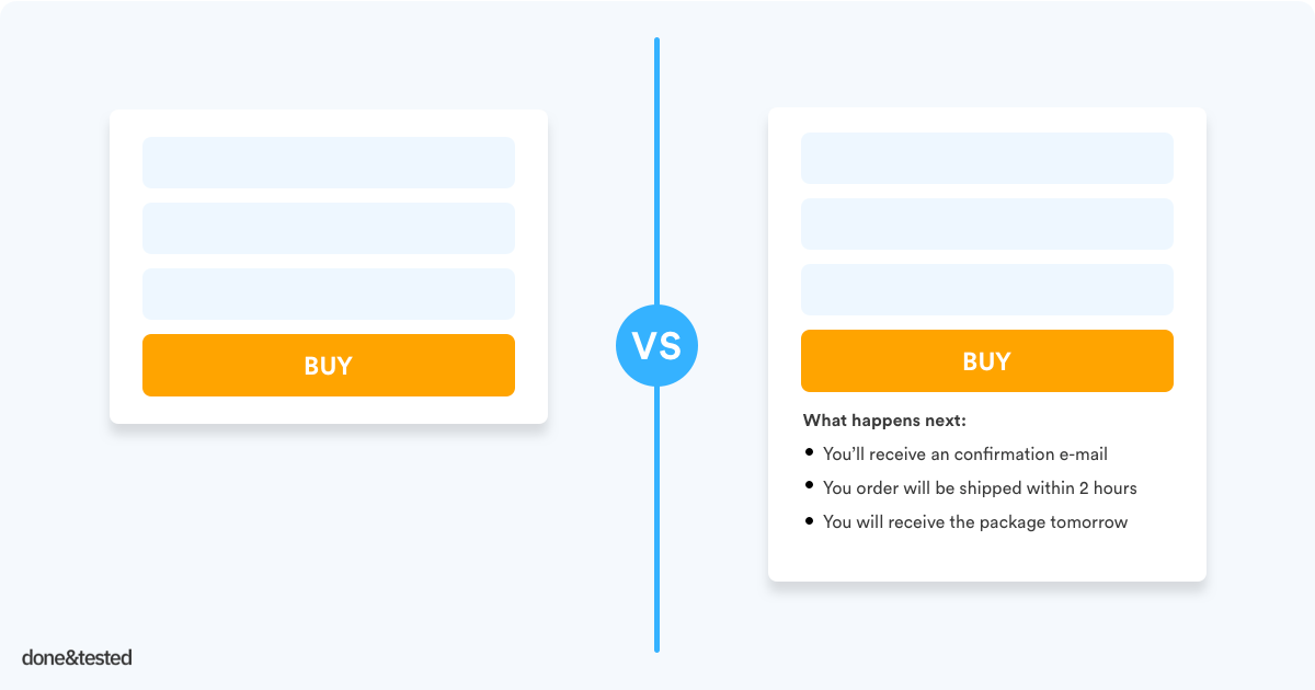
Even when your visitors are just one click away from buying, they may still have some last minute fears, uncertainties and doubts (FUD’s). You should take away these doubts as much as possible.
learn more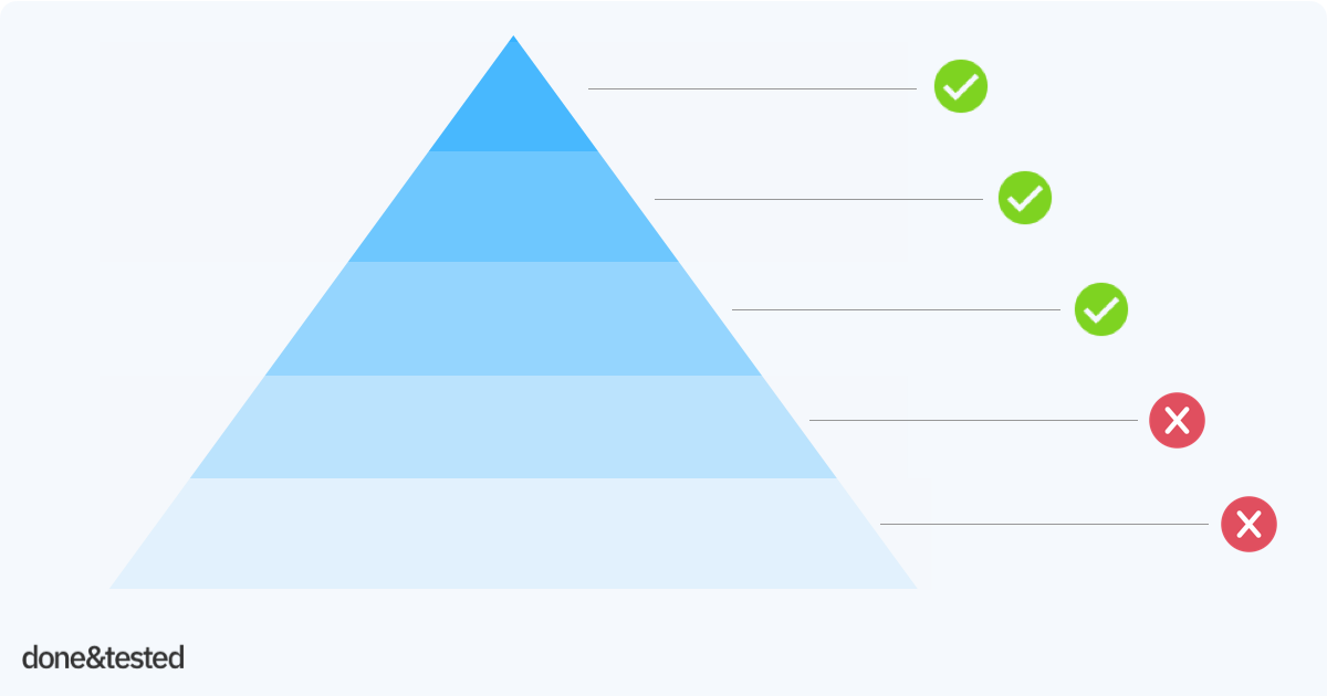
Do you know the awareness levels of your prospects? Are they just orientating – or ready to buy? Before you can sell your product to anyone, your prospects need to know three essential things with the prospect awareness pyramid.
learn more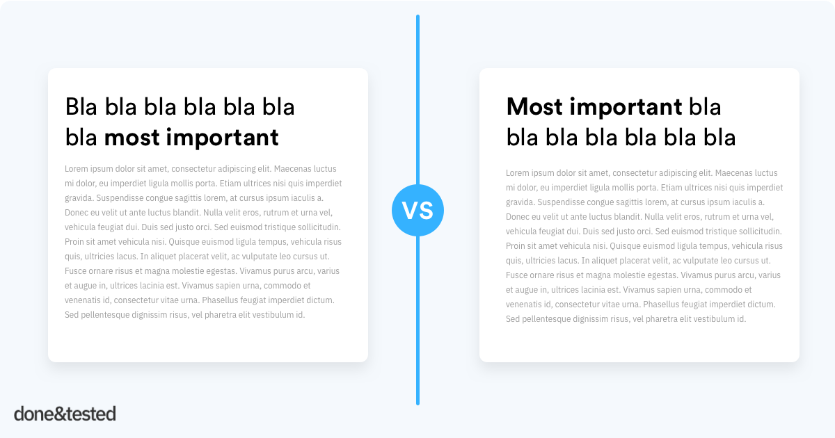
Your value proposition (or headline) can make or break your page. Within a split-second people decide if they stay or leave. Having a clear headline is super important.
learn more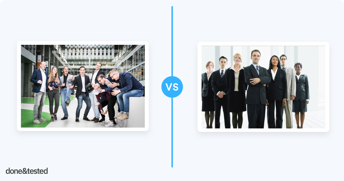
A great way to ruin your trust, empathy and authority is using cheesy stock photos. Research by MDG Advertising reveals that 67% of online shoppers rated high quality images as being very important to their purchase decision.
learn more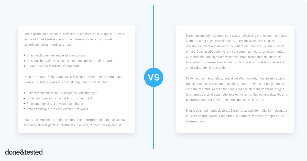
People don’t really read your page. They quickly scan it, and if they like it, they might read. Your page should be easy to scan.
learn more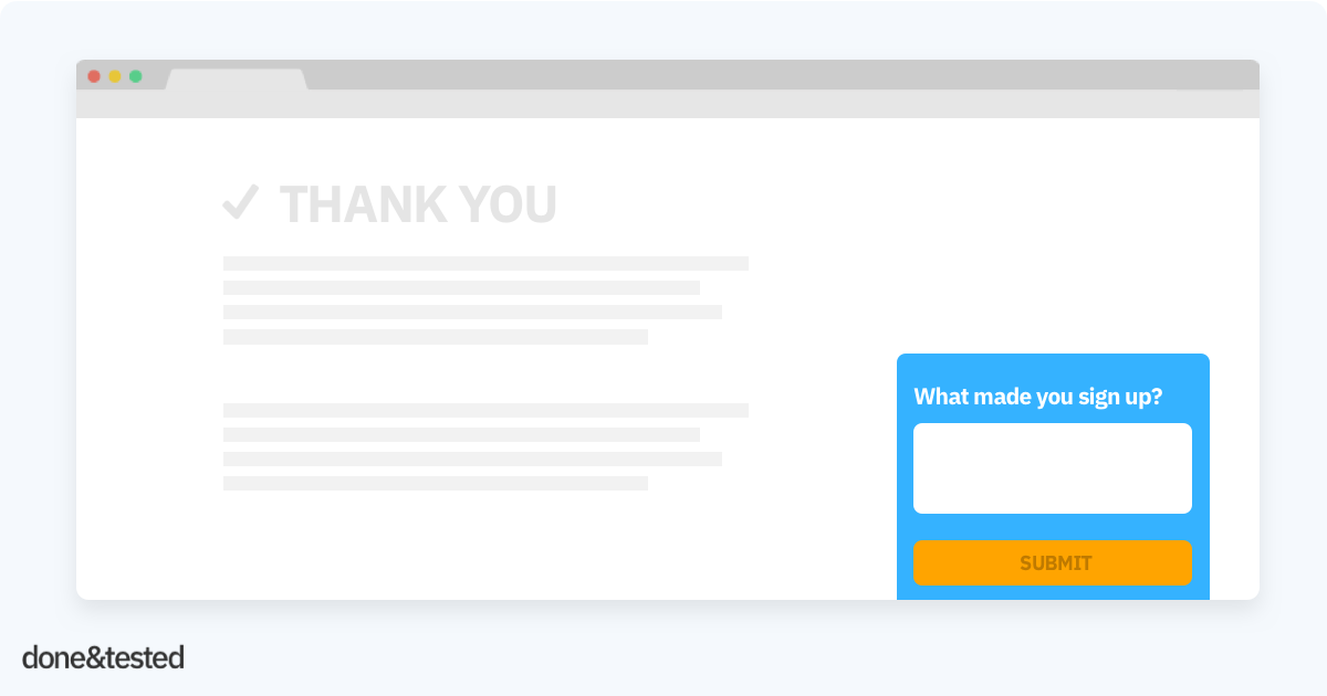
You can gain a lot of very valuable insights from your existing customers when you want to optimise your site. After all, if there’s anyone who knows what the main reason…
learn more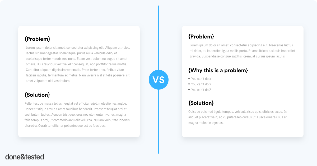
If you are solving a problem of your customers, such as back pain, it’s sometimes very effective to emphasize the pain – before presenting your solution. So, how does it work?
learn more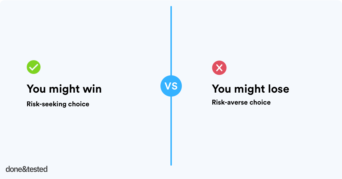
People are risk-averse when they have something to gain. When people have something to lose, they take more risks. People won’t take a lot of risks when they could win $100…
learn more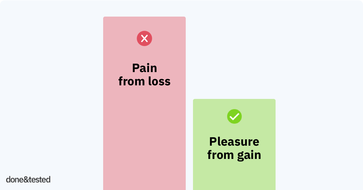
The pain of losing is psychologically about twice as powerful as the pleasure of gaining, known as the Loss Aversion principle.
learn more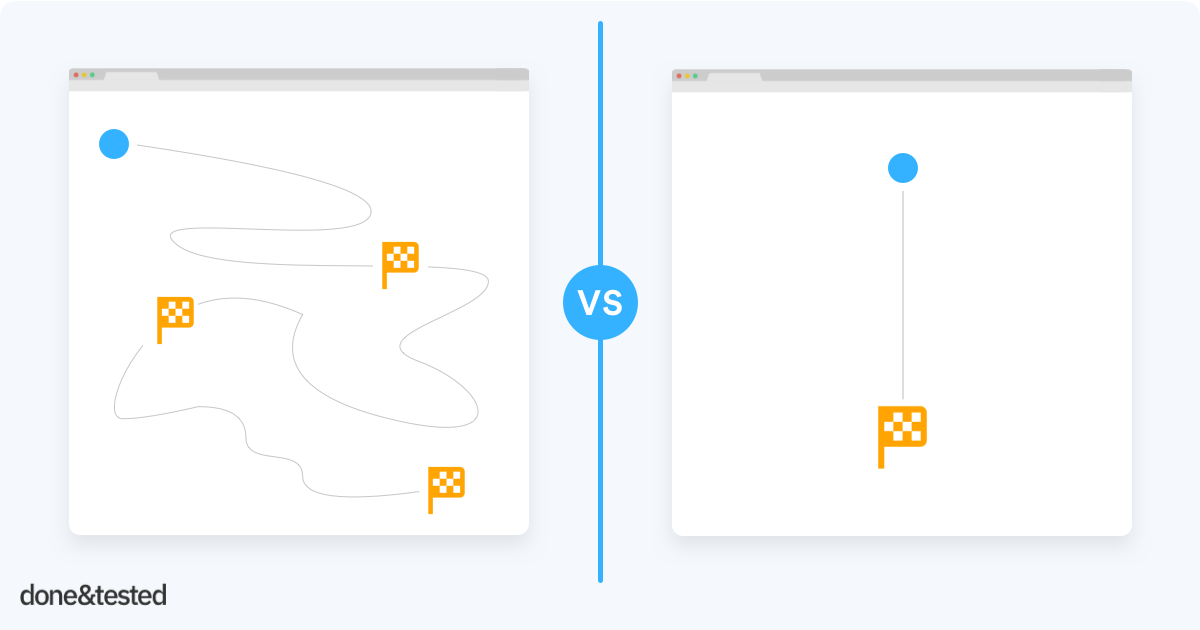
Each landing page should only have one goal. Not two, not three. Just one. Marketers sometimes squeeze several goals on one page, with the thought of ‘if people don’t want to sign up, perhaps we can offer a whitepaper as an alternative‘. Nope!
learn more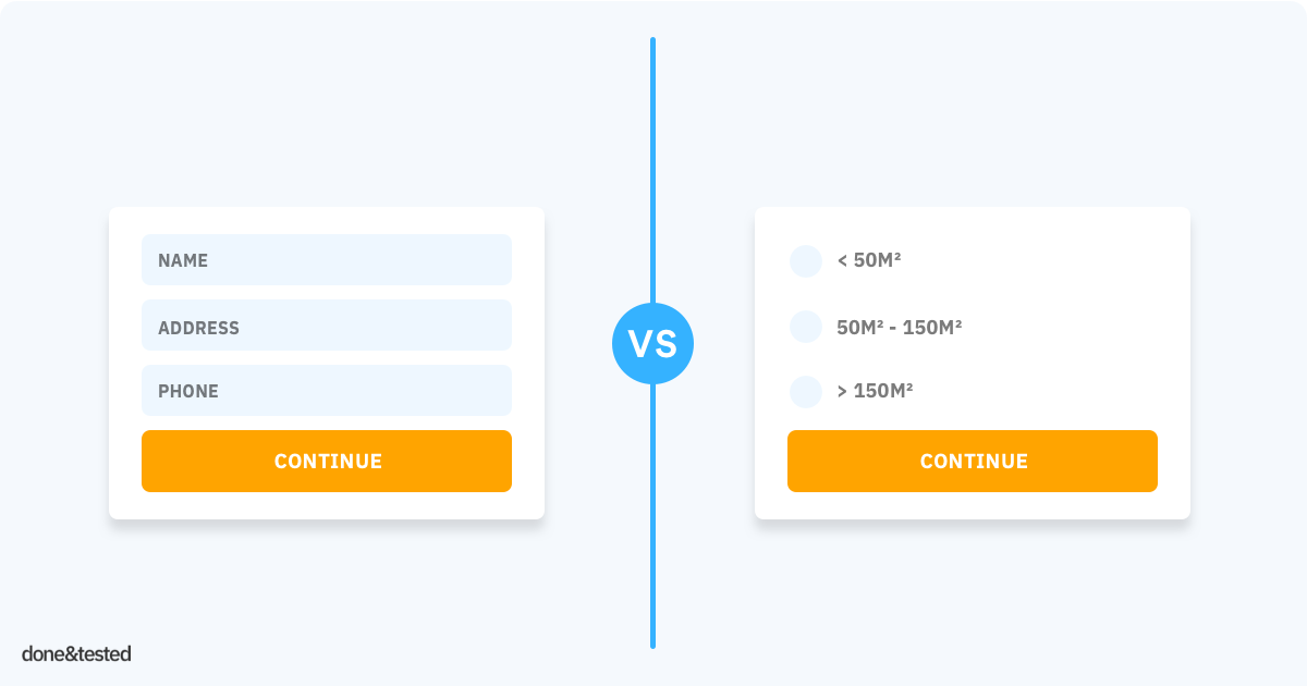
The foot-in-the-door technique is a widely used method in door-to-door sales. Someone who complies with a small initial request will be more likely to agree to a later, bigger, request. If the request had been asked outright, they would not have agreed.
learn more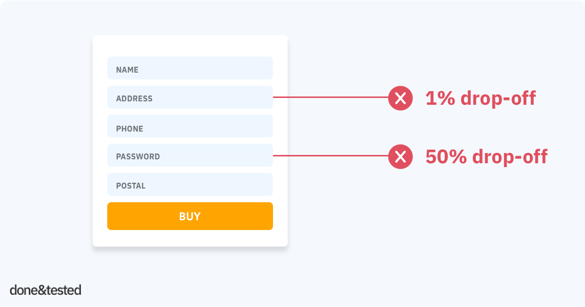
You know that people abandon your forms. But, do you know which form fields are causing people to stop and leave your site? Is it your password field, address field or perhaps the name field?
learn more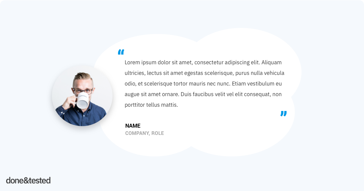
Does your page contain testimonials? What would a landing page be without testimonials? Visitors won’t trust your product if no one recommends it. You need customer testimonials on your landing page to win their trust.
learn more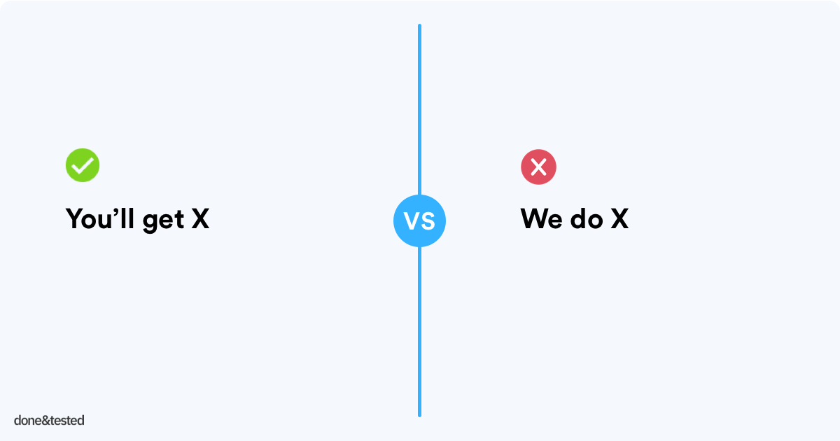
Your visitors don’t care about you, frankly put. They quickly want to know what’s in it for them. Many websites are using an inside-out approach in their copywriting style. It’s all about the company itself, not about the customer.
learn more
Seconds and mini-seconds matter. Your website’s speed might have a bigger impact on your conversion rates than you might expect.
learn more
It should be super clear what you want your visitors to do. If you look at your page through your eyelashes, is your form visible? Is it standing out from the crowd?
learn more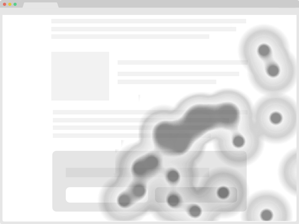
Analytics software will tell you what links people clicked, but not where exactly. With a click map (or heatmap) you can exactly see where people clicked.
learn more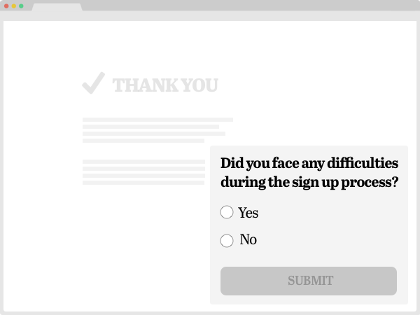
This is probably not the first thing you’ll think of when running surveys on your page, but you’ll be surprised how many insights you can get from this.
learn more
Each week I share a conversion rate optimization (CRO) tip or insight I love - or just blows my mind. Would you like to share a tip as well? Drop me an email here.
All tips are meant as inspiration and I recommend split-testing them; they might not work for your site' audience. Done&Tested is curated by Gijs Wierda, a freelance CRO specialist.