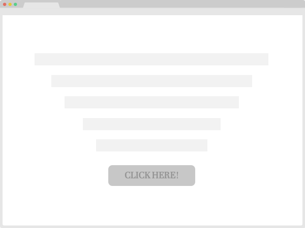
If someone points their finger to the left, you’ll probably look to the left as well. Humans are wired to follow visual and directional cues. Imagine an airport without cues… you’d be lost within seconds!
You can apply the same principle on your landing page. You can draw someone’s attention to your main CTA by adding (subtle!) visual cues. A very popular way is using arrows in your design. Another way is creating a tunnel vision by making elements point to each other.
Be notified when I publish a new CRO tip:
Each week I share a conversion rate optimization (CRO) tip or insight I love - or just blows my mind. Would you like to share a tip as well? Drop me an email here.
All tips are meant as inspiration and I recommend split-testing them; they might not work for your site' audience. Done&Tested is curated by Gijs Wierda, a freelance CRO specialist.